EOE Design - SLM Archeologic Logo 04x1 - Design - SLM Archeologic Logo 04×1 – Design
Arqueología_ 3:
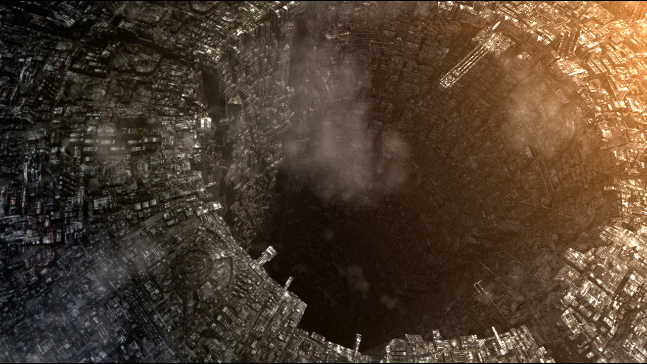
The sun was rising from one end of XCF34’s distant and lifeless moon, which was once habitable. Remnants of technology here and there suggested that it was once a colony orbiting the last gaseous planetary body in the Wolf system. A place of passage and commerce located in the Wolf system and that was forgotten in time. Near the busy Ross systems this moon and its companion micro system gave way to the known edge sectors and to the ends of the galaxy where settlers and explorers continued to find systems to explore or places to settle.
A team of archaeologists dressed in EVA suits very well adapted to the needs of the environment, and to the usual movements of scientists, capable of withstanding high radiation and equipped with the latest advances in electronic readings, were scattered around what looked like an excavation. The suits started with a black line on the left, fading to white on the right, where the SLM ARCHEOLOGY company logo was located.
Specialists in various fields of research walked the surface of the moon just at dawn, in the first rays of blue-gray light offered by the star combined with the great gas giant, this was due to its highly deteriorated atmosphere. For this reason, scientists and archaeologists had to take advantage of all the hours that they could from sunrise and sunset, spending the rest of the lunar day in research ships and stations, doing laboratory work.
It was a small group of specialists, captained by Dr. Suárez and supervised by Sul, the head of the company who liked to appear at each of the excavations and projects to be close to his men, since he always liked to do field work, although circumstances did not always make it easy for him. The company had some executives who ran the company while Sul paced from dig to dig, feeling close at hand for all the discoveries being made, especially if they were from the ‘Em civilization, of which he was a great expert.
SLM Archeologic’s logo
With the previous lines a part of the essay is collected that gives life to the main story. This chapter introduces two main characters, Sul and Ludic, who own SLM ARcheology, the corporation from which we bring their logo today.
SLM Archeology is dedicated to investigating archaeological sites throughout the galaxy with a very clear mission, to find all the possible vestiges about the enigmatic civilization `Em of which Sul and Ludic are the most outstanding experts and who of course on their way have been able to finance a multitude of excavations with which to get endless research, further development and subsequent sale to all interested companies and corporations.

The SLM logo shows an anagram similar to a star system, with three circles that converge at the bottom forming the orbits, in which it presents a well differentiated gray gradient, from darker to lighter and that at the top we it shows a sky blue star center.
Below this are the abbreviations SLM in white with shadows on the anagram to highlight these initials on the background. Finally, the word “Archeology”, which would be the description of the corporation, is presented with the same futuristic, rounded and dynamic typography as the initials, with the same blue color of the simulation of the star in the center of the star system.
SLM colors are directly related to bio-geology, in the case of the gray gradient and with life and stars, this light blue being the final choice to the detriment of a green or a more intense blue. The intention of this blue was not only to combine it with life but also with the colors of stars, being blue a common color and very appropriate for the occasion.
Finally we must mention before finishing the authors of this logo, being outlined by Carlos Lorite and executed by Jenni Arismendi.
In future posts we will unveil our characters, as well as new team members. Stay tuned because Beyond Space will enter a new phase.